Case Study
Progressive Registration: Redefining Onboarding for Millions at MoneyGram
Modernizing onboarding to build trust and accessibility for users across the U.S. and Mexico. I led the UX redesign that transformed a compliance-heavy flow into a simple, confidence-building digital experience.
Reading time: 5–6 minutes
Role: Lead UX Designer
Year: 2024
Platform: Enterprise Fintech (MoneyGram Global)

Why This Project Mattered?
When I joined the onboarding team, MoneyGram faced a quiet but costly issue: thousands of users started registration but never finished. What looked like a simple usability gap turned out to be a deeper issue of trust and accessibility.
That realization led me to reimagine onboarding around a new design principle:
“Earn trust progressively, not demand it upfront.”
The Challenge
MoneyGram operates at the intersection of compliance, finance, and human connection.
In markets like Mexico, many users relied entirely on in-person transactions. But digital onboarding
offered them something retail couldn’t: freedom, flexibility, and access.
Strict KYC (Know Your Customer) rules forced early ID verification, which caused users to drop off
— especially those unfamiliar with digital verification.
Core Challenge: How could we reduce friction and make digital onboarding approachable for
first-time users, expanding adoption while maintaining compliance?
My Role: I led UX research, end-to-end design, and prototyping while coordinating with product,
compliance, and engineering teams in Dallas and Mexico City.

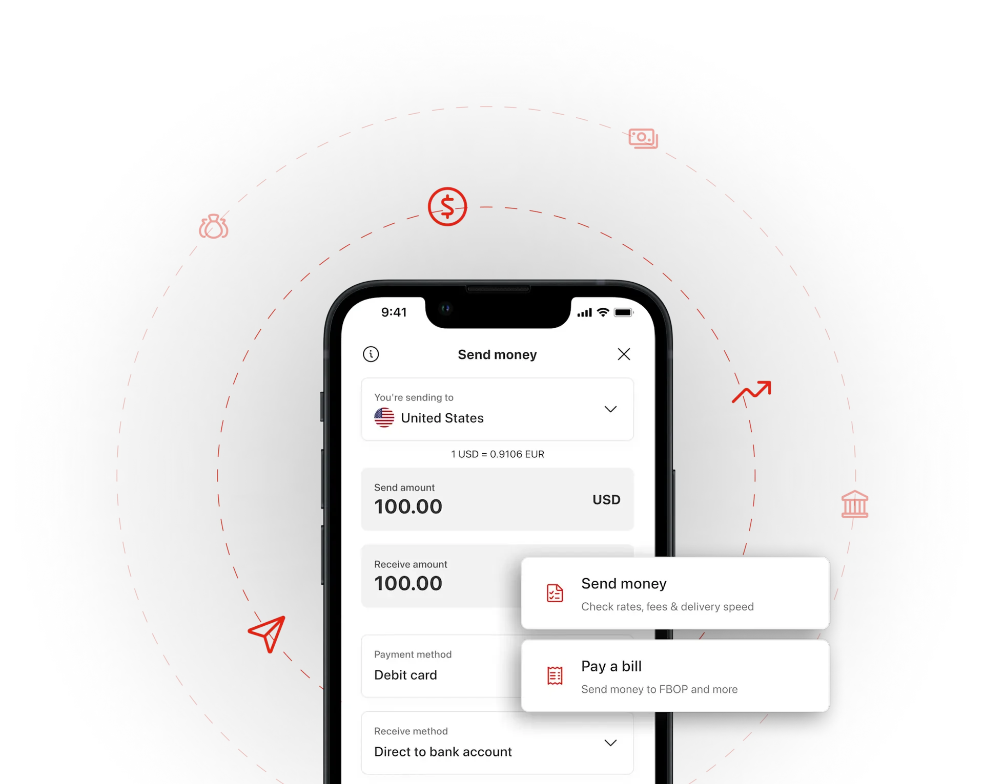
The Solution — Designing for Progressive Trust
We realized users didn’t need fewer steps — they needed more confidence in every step. So, I
reframed the flow around trust-building milestones instead of static forms.
Solution pillars:
• Progressive disclosure: Show only what’s essential early on.
• Empathetic microcopy: Explain the why behind verification.
• Visual reassurance: Inline validation, progress indicators, and security icons.
• Empowerment: Highlight how digital use unlocks flexibility and removes the need for multiple store
or bank visits.
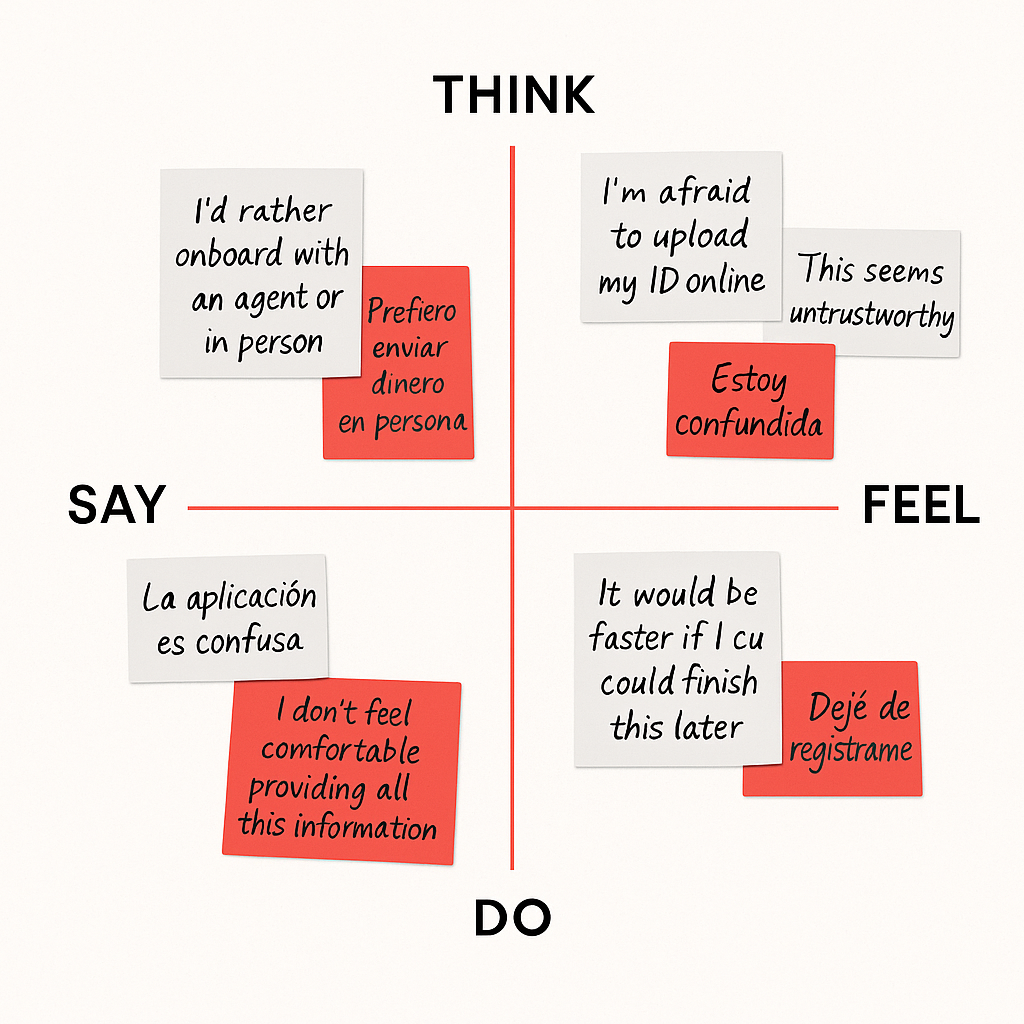
The Discovery — Listening Before Designing
I began by mapping the existing registration funnel and auditing analytics data. Over 60% of users
dropped off in step two — right at the verification stage.
Through 8 remote usability sessions across the U.S. and Mexico, three insights stood out:
1. Users wanted to explore the app before sharing sensitive info.
2. The tone of compliance copy felt cold and intimidating.
3. Many traditional users saw retail as the “safe” way, unaware that digital offered equal security
and more convenience.
Quote: “I didn’t know I could just do everything on my phone. It would save me two or three trips to
the bank.”

The Design Journey — Building Clarity and Confidence
We treated onboarding like a conversation, not a checklist. Each interaction was crafted to inform,
reassure, and empower.
Core improvements:
1. Reduced early fields to essentials only.
2. Added educational hints like “Verifying your identity helps unlock higher send limits.”
3. Integrated auto-save and pause/resume flow.
4. Introduced soft transitions, micro animations, and empathetic tone.
Testing & Iteration — Letting Data Lead the Design
I ran three iterative testing rounds, each validating or refuting assumptions through direct user
interaction.
Results:
• v1: Deferred KYC until value was established ® -28% drop-off
• v2: Introduced trust microcopy & motion feedback ® +12% completion
• v3: Added auto-save & flexible resume ® +24% re-engagement
User feedback: “It finally feels like the app wants me to succeed.”
Launch & Impact
We treated onboarding like a conversation, not a checklist. Each interaction was crafted to inform,
reassure, and empower.
Core improvements:
1. Reduced early fields to essentials only.
2. Added educational hints like “Verifying your identity helps unlock higher send limits.”
3. Integrated auto-save and pause/resume flow.
4. Introduced soft transitions, micro animations, and empathetic tone.
Reflection — What I Learned
This project taught me that compliance isn’t a blocker — it’s an opportunity to design for confidence,
not constraint.
Key takeaways:
• Friction can become clarity when users understand why.
• Accessibility starts with empathy, not technology.
• Designing for emerging digital markets means designing for trust at every level.
The Takeaway
This wasn’t just a registration redesign; it was a bridge between traditional trust and digital freedom.
We didn’t just optimize a flow — we helped real people feel safe embracing a new way to move
money.
“Progressive onboarding became our north star for every launch that followed.”